3 min read
TAKE A BREAK
How to Make AI Images That Look Good
Updated: 6/3/2026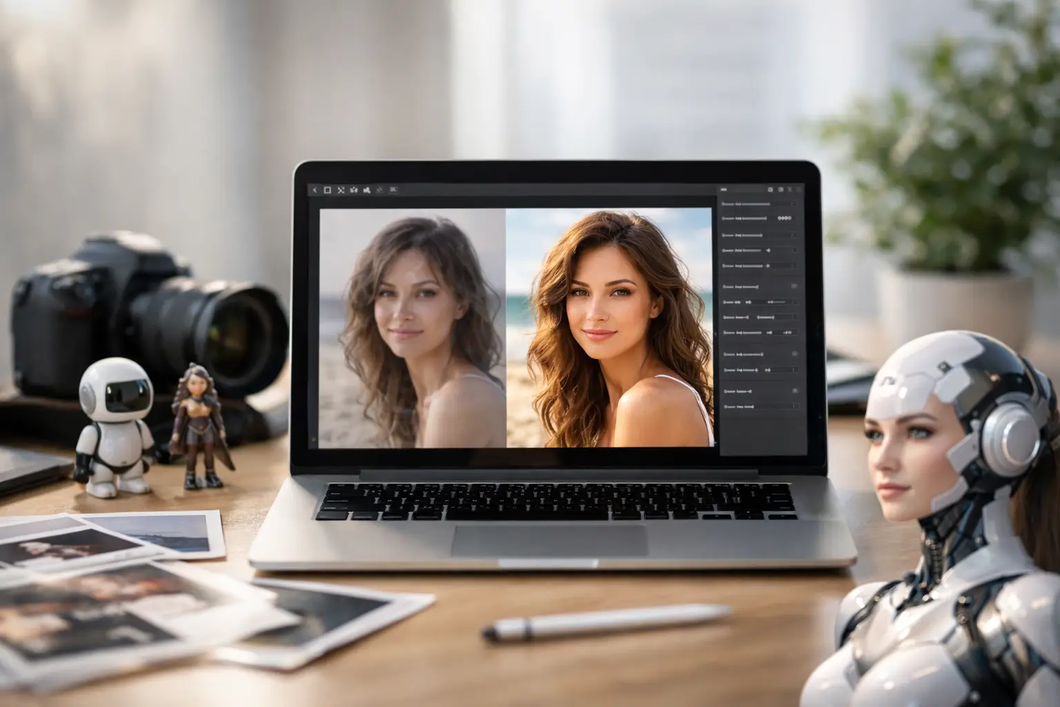
You can tell when someone typed five random words into an image generator and hoped for the best. The result usually has melted hands, confused lighting, and that vaguely shiny look that screams AI. If you want to learn how to make AI images that actually look intentional, the good news is that the gap between bad and good is usually not talent. It’s a better prompt, a clearer idea, and one or two smart edits.
AI image tools have gotten wildly accessible. You don’t need to be a designer, illustrator, or prompt wizard to get something solid. But you do need to know what the tool is good at, where it struggles, and how to guide it instead of tossing in a vague request and crossing your fingers.
How to make AI images without getting weird results
The biggest mistake beginners make is being too broad. If you type “a cool futuristic city,” the AI has to guess what cool means, what kind of city you want, what time of day it is, what style fits, and what should be in the frame. That’s a lot of guessing, and AI is happy to guess wrong.
A stronger prompt gives the model a job it can actually do. Think in layers. Start with the subject, then add setting, lighting, camera angle, style, and mood. Instead of “a cool futuristic city,” try “a neon-lit futuristic city street at night, rainy pavement, cinematic lighting, street-level view, realistic style, high detail.” Suddenly the image generator has direction.
This is where a lot of people overcomplicate things. You do not need to write a novel. You just need enough detail to remove confusion. Good prompts tend to be specific, not long for the sake of it.
Start with the image in your head
Before you open any AI tool, decide what you want the picture to do. Is it for a social post, a thumbnail, a profile image, a product mockup, or just something fun? That changes everything.
If you’re making a YouTube thumbnail, bold composition matters more than subtle detail. If you want a phone wallpaper, mood and color might matter more. If you’re creating a fake magazine cover or concept art, style becomes the main event. The clearer your purpose, the easier it is to write a useful prompt and judge whether the result is actually good.
This also helps you avoid one of the sneakiest AI traps: generating images that look impressive for two seconds but fall apart when you look closer. A dramatic fantasy portrait might be great as a background image and terrible as a print. It depends on where it’s going.
The five prompt details that matter most
If you’re stuck, focus on five things: subject, setting, style, lighting, and composition. That combination fixes most weak prompts.
The subject is what the image is about. The setting tells the AI where it exists. Style shapes the visual language, whether that’s photorealistic, anime, watercolor, retro ad, or something else. Lighting changes mood fast. Composition tells the tool whether you want a close-up, overhead shot, wide scene, portrait framing, or something more cinematic.
For example, “golden retriever in a park” is fine, but “golden retriever running through a fall park, golden hour lighting, shallow depth of field, realistic photography, action shot” is much more likely to produce something worth saving.
Pick a style and stick to it
One reason AI images look messy is that the prompt asks for too many visual directions at once. “Photorealistic cartoon painting in anime cinematic vintage style” sounds creative, but it often creates a visual identity crisis.
Most of the time, you’ll get better results by choosing one dominant style and letting the tool build around it. If you want realism, lean into photography language like lens, depth of field, natural light, and texture. If you want illustration, use terms tied to brushwork, line art, poster design, or digital painting.
This doesn’t mean you can’t mix ideas. You can. But if you’re new, start clean. One subject, one style, one mood. Then experiment once you know what the model does well.
Words that usually help
Some prompt terms tend to improve output across many generators. “Cinematic lighting,” “high detail,” “soft shadows,” “editorial photography,” “minimalist background,” and “sharp focus” are common because they work. They’re not magic, but they can push the tool toward cleaner results.
At the same time, too many quality words can turn into fluff. If every prompt includes “ultra detailed, masterpiece, best quality, stunning, award-winning,” you’re not really giving better instructions. You’re just yelling adjectives at a robot.
Use reference images when the tool allows it
Text prompts are great, but reference images can save a lot of time. If your tool lets you upload an image for inspiration, use it when you want a specific pose, color palette, outfit vibe, or composition.
This is especially useful for people who know what they like visually but struggle to describe it. A reference image can anchor the AI, while your text prompt tells it what to change. You might upload a portrait with strong side lighting, then prompt the generator to turn it into a sci-fi version with metallic clothing and a futuristic background.
The trade-off is that some tools cling too hard to the reference and limit creativity. Others wander too far. You usually need a few tries to find the balance.
Expect to generate first and edit second
A lot of people assume the perfect image should come out in one shot. That’s not really how this works. Good AI images often come from iteration.
Generate a few versions. Keep the one with the best composition or vibe, even if small parts are off. Then refine. Maybe the face works but the background is messy. Maybe the colors are great but the hands are cursed. Fixing one issue is easier than starting over from scratch every time.
Most AI image workflows now reward this approach. You can upscale a good result, expand the frame, regenerate a section, remove an object, or tweak the prompt based on what almost worked. That’s where the quality jump happens.
How to make AI images look more real
If your goal is realism, the trick is often restraint. AI gets exposed when the image tries too hard. Overly dramatic skin texture, impossible reflections, too many objects, and hyper-glossy lighting can all make the result feel fake.
Ask for believable details instead. Natural lighting. Real camera angles. Everyday environments. Slight imperfections. A portrait taken near a window in soft morning light usually lands better than a hyper-stylized glamour shot with ten competing effects.
It also helps to think like a photographer. What lens would make sense? Is the background supposed to be blurry? Is the subject centered, or off to one side? When you give the AI visual logic, it tends to behave better.
Common AI giveaways to watch for
Hands are still a classic problem, though many tools are better than they used to be. Text inside images can also break badly, especially on signs, labels, and clothing. Jewelry, glasses, teeth, and symmetrical patterns are worth checking too.
If something looks off, zoom in. A gorgeous image at thumbnail size can become chaos up close. This matters if you’re using the image for anything beyond casual scrolling.
Editing is not cheating
There’s a weird idea that using AI means the image should be fully finished the second it appears. That’s not how creative tools work. Editing is part of the process.
Even quick edits can make a major difference. Crop the frame to improve focus. Adjust contrast if the image feels flat. Clean up awkward areas. Remove extra fingers if the tool didn’t get the memo. If the AI gave you 85 percent of a good image, you’re allowed to take the last 15 percent yourself.
This is also where taste matters more than tech. Two people can generate the same image and one will know exactly how to tighten it up. The better your eye gets, the better your AI images get.
Know the limits before you promise too much
AI image generators are fast, fun, and surprisingly capable, but they’re not mind readers. If you need exact brand consistency, highly specific product details, or flawless typography, you may hit a wall. Some tasks still require manual design work or at least a lot more cleanup.
There are also ethical and legal gray areas depending on how you use the images, especially for commercial work or when mimicking a living artist’s style too closely. If you’re making something just for fun, the stakes are lower. If it’s for business, marketing, or client use, slow down and check the tool’s usage rules.
That might sound like a buzzkill, but it’s really just part of using the tech like an adult. Fast doesn’t mean consequence-free.
The easiest way to get better fast
The fastest shortcut is simple: remake images you admire. Not by copying them exactly, but by reverse-engineering what makes them work. Look at the lighting, framing, color, mood, and style. Then build prompts around those ingredients.
You’ll start noticing patterns. Clean backgrounds work. Specific lighting works. Strong composition works. Vague prompts don’t. Once that clicks, making better AI art feels less like gambling and more like directing.
If you’re figuring out how to make AI images for the first time, don’t chase perfection on prompt number one. Chase clarity. Give the tool a stronger brief, keep what works, and tweak what doesn’t. The best results usually come from people who treat AI less like magic and more like a very fast, slightly chaotic creative assistant.
And honestly, that’s the fun part - when your idea stops living in your head and starts showing up on screen close enough to surprise you.